Unit Bar Charts that aren’t

Hey datafam, I’m back with a new blog post that is long overdue!

Some weeks ago, I noticed that my Tableau buddy, Rodrigo Calloni, asked how to do a Unit Chart with the category labels on top of the bars. There a couple of great tutorials on how to do this by Jeffrey Shaffer and Rajeev Pandey, you can read them here and here.

I took a different approach where I draw unit bar charts that aren’t bar charts. I adapted this method from the #workoutwednesday challenge 2018 week 11.

Basically what I did was to draw a series of characters that emulate a bar chart, this method has been used on the Excel community for many years using the REPT() function.

First, we need to normalize the measure that we are going to use on the dimension(s) we want to use, this will allow us to determine how many “units” we are going to draw for each member of the dimension(s).

I created a parameter to choose different dimensions, this will depend entirely on your preference, I wanted to select either Category, Sub-Category or State:

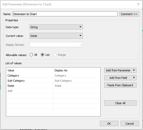
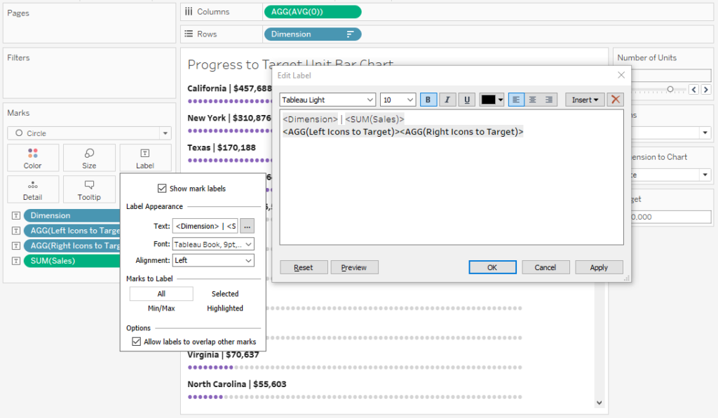
Then with this parameter I created a field called [Dimension], this is the code:

[Dimension]
CASE [Dimension to Chart]
WHEN ‘Category’ THEN [Category]
WHEN ‘Sub-Category’ THEN [Sub-Category]
WHEN ‘State’ THEN [State]
END

I want to make a Sales unit chart so I need to normalize the Sales according to the dimension selected with our parameter, to do this, first I need to get the maximum sales value according to the parameter selection, this is the calc I created:

[Max Sales]
{MAX({FIXED [Dimension]:SUM([Sales])})}

Then the normalized sales

[Sales Normalized]
SUM([Sales])/SUM([Max Sales])

This last calculation will give us the proportion of each member of the dimension respect to the member with the max value within that same dimension.

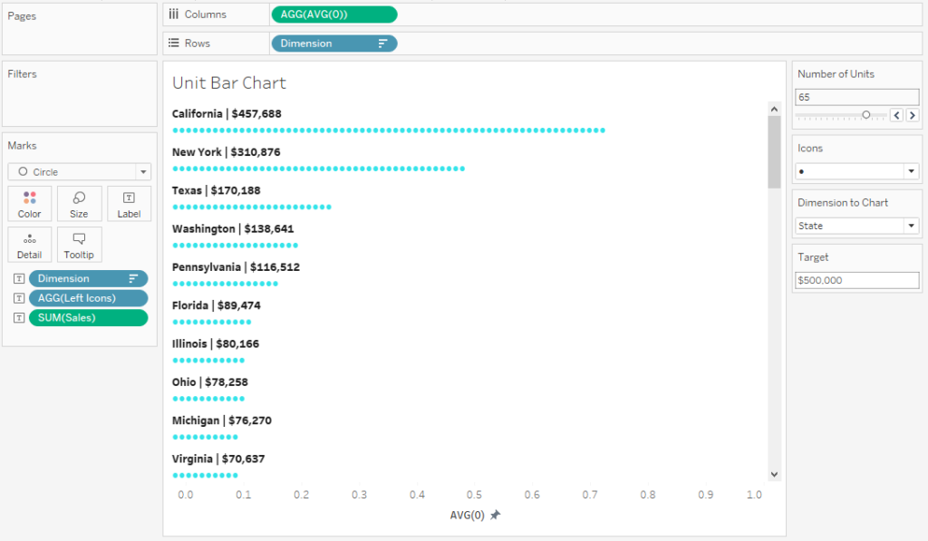
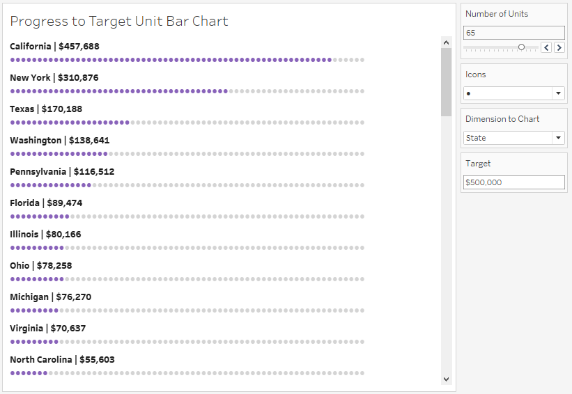
Then I created a new parameter called [Number of Units] that can accept any integer, this parameter will be used to establish how many “units” we want to display for the maximum value within our dimension, for example, if “California” has the max sales value across all states and the number of units to display that I selected is 20, then California will have 20 units on the unit bar chart.

To calculate the number of “units” for each member I use the following formula:

[Number of Units by Cat]
FLOOR([Sales Normalized]*[Number of Units])

I used the FLOOR() function to get a whole number, you can use either ROUND to zero or CEILING, up to you.

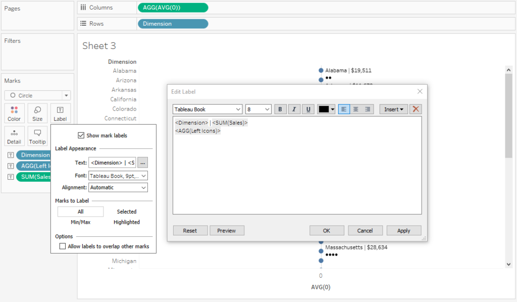
To draw each unit “icon” I used the following calc:


[Icon Repetition]
REPLACE(SPACE([Number of Units]),” “,[Icons])

The field [Icons] is just a parameter with a bunch of ASCII characters that will serve as icons to our unit chart. The SPACE function repeats a “space” character by [Number of Units], if we have 20 in our parameter, it will repeat “space” 20 times. Then REPLACE will replace the “space” characters by our [Icon] character.

But we don’t want to repeat 20 times our icon on each of our category members, we want the display the number of units according to their respective normalized sales, so we use another calculation:

[Left Icons]
LEFT([Icon Repetition],[Number of Units by Cat])

This calc will take “x” number of units calculated with the [Number of Units by Cat] from the left side of the string that was created with the [Icon Repetition] field.

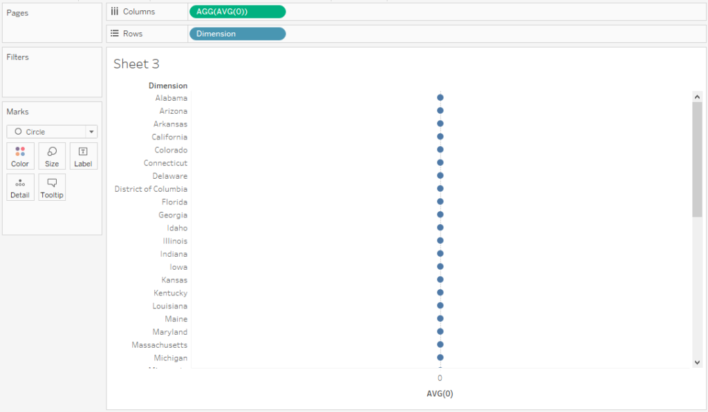
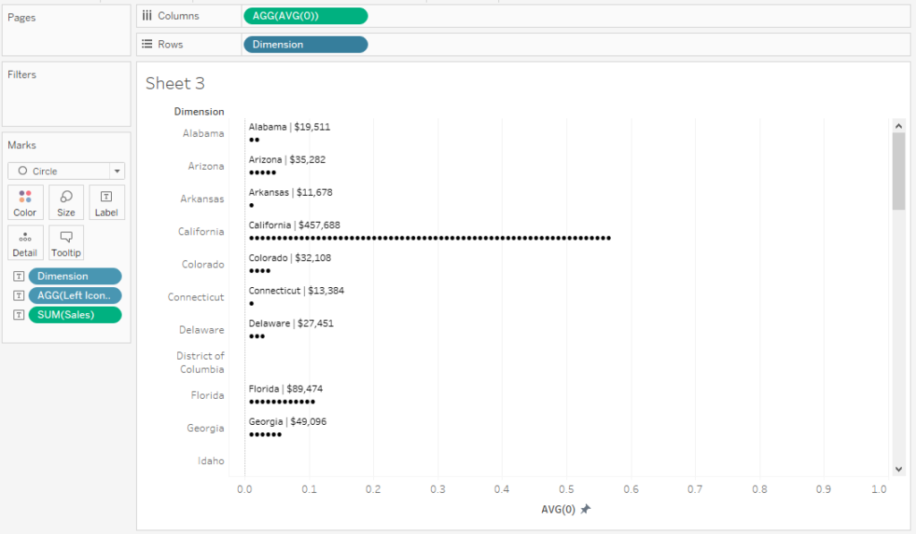
Now, we are ready to build our unit chart.

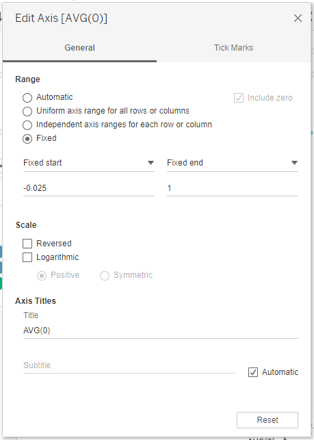
First drag the [Dimension] field to rows and a placeholder measure AVG(0) to columns, change the marks card to “Circle”, you will have something like this:

Then drag the [Dimension], [Left Icons] and [Sales] fields to the Text card and open the edit window for the label, arrange the text and labels like the picture:

Edit your AVG(0) measure axis to Fixed start: -0.025 and Fixed end: 1 (this settings will depend on your data, change accordingly to make it look right).

Then adjust with your mouse the height of your [Dimension] field row headers to allow the label text to show on each category and decrease the size of the circles to zero and make them transparent, set the border to “None”.

After making the necessary adjustments hide the row headers of the [Dimension] field. Don’t forget to sort your [Dimension] field using the [Sales Normalized] field.

Clean up your chart by removing the gridlines, axes rulers, etc. Pick a nice color for your circles and you are set!

With the parameters you can change the number of units displayed for the maximum value, the type of character used for the unit and the dimension you want displayed.

Unit Bar Chart Progress to Target

If you want to setup a target, we need a few more calculations and a parameter. The parameter will allow us to set our desired target, I called it [Target].


Then we need to normalize our sales respect to our Target, to know how much of the target we have accomplished:

Sales Normalized to Target
SUM([Sales])/[Target]


Then we multiply that normalization by the [Number of Units], this will give us the number of “units” we are still missing from the target:


Number of Units by Cat to Target
FLOOR([Sales Normalized to Target]*[Number of Units])


Our sales will be now normalized to a target not a maximum value so now we need a new calculation for our “left icons”

Left Icons to Target
LEFT([Icon Repetition],[Number of Units by Cat to Target])

Then we draw the number of units that we are missing to accomplish from our target, this will draw the icons on the right of the unit chart:

Right Icons to Target
IF [Sales Normalized to Target]<=1 THEN
RIGHT([Icon Repetition],[Number of Units]-[Number of Units by Cat to Target])
END

Place the [Left Icons to Target] and [Right Icons to Target] fields on the text card and using the edit window make the following arrangement (choose different colors for the left and right icons):

After changing the format, you will get something like this!

That’s it! Hope you liked it, don’t forget to comment and share!

Full viz HERE!

Thanks
Adolfo

Leave a Comment

Your email address will not be published. Required fields are marked *